Evolving LinkedIn’s Brand Expression
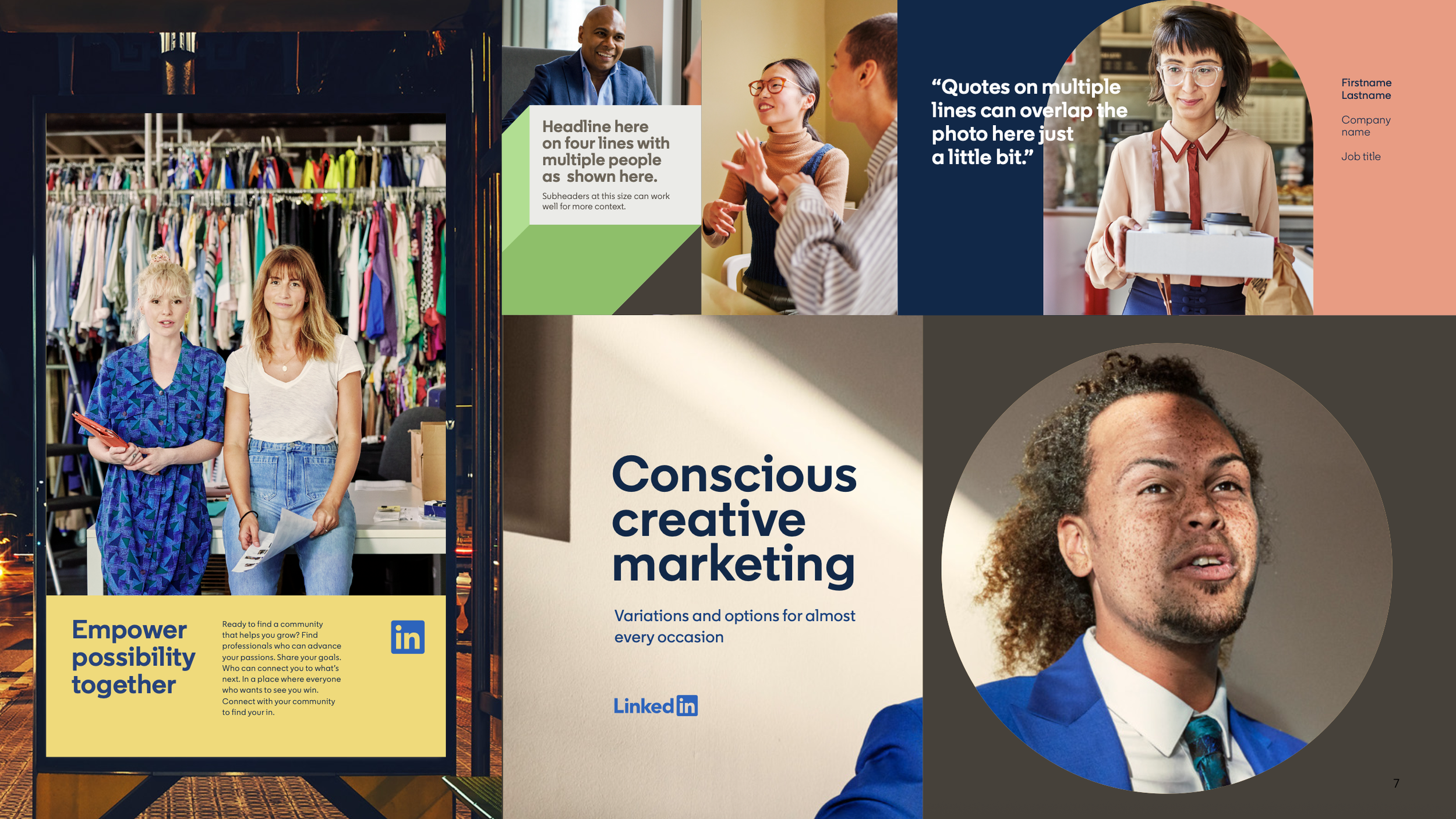
As LinkedIn grew beyond its roots as a traditional professional networking platform, the brand needed to better reflect the diversity, creativity, and individuality of the modern workforce. This work evolved LinkedIn’s visual identity while preserving the trust and recognition that made it one of the world’s most recognizable professional brands.
-
LinkedIn's existing visual identity had established strong brand recognition, but the system had become increasingly limited in its ability to support the growing range of content, audiences, and experiences across the company. The challenge was to evolve the brand expression in a way that felt more flexible, expressive, and scalable while maintaining consistency across global marketing, editorial, social, and experiential channels.
-
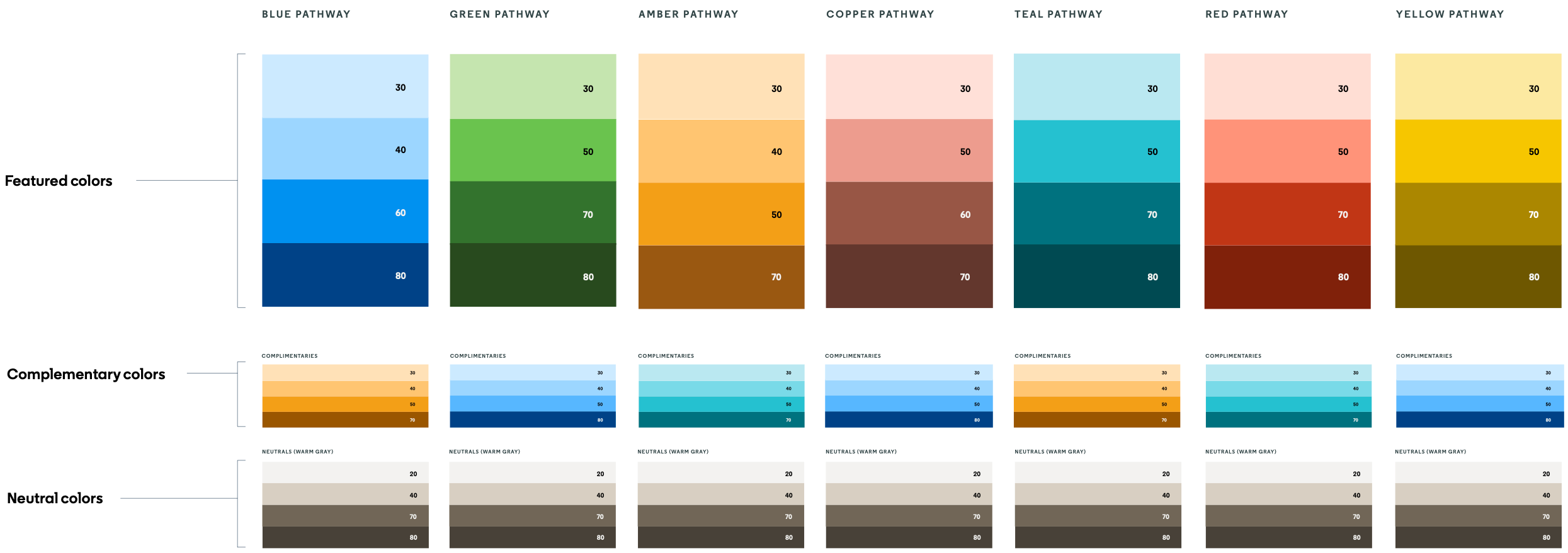
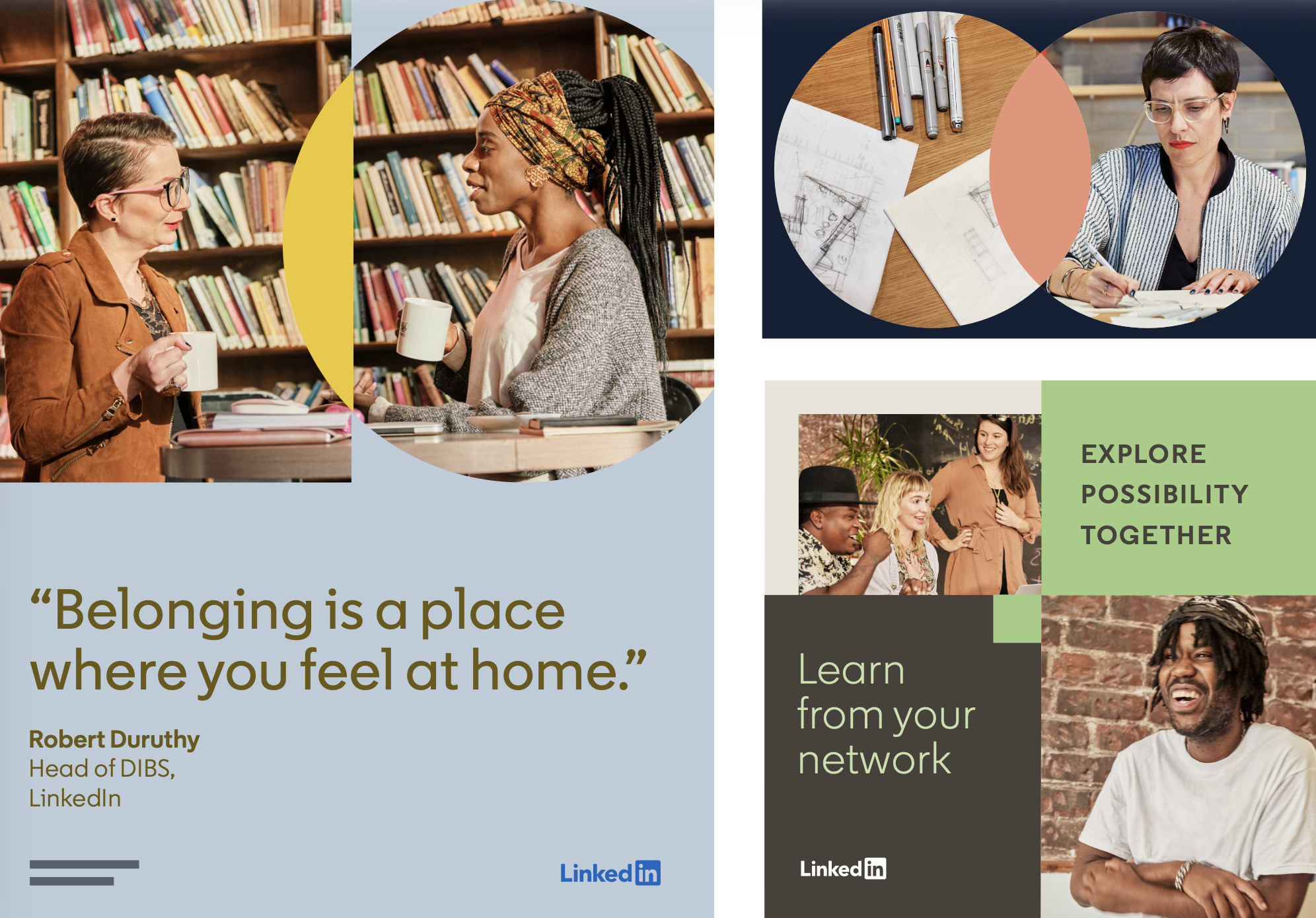
Starting with the existing brand platform as a foundation, I explored new ways to extend the visual language through expanded shape systems, a broader and more intentional color framework, and typography that could function as both information and graphic expression. One of the key contributions was the development of "Color Pathways"—a curated system of color families that simplified decision-making and enabled both designers and non-designers to create work that felt cohesive, expressive, and unmistakably LinkedIn.
-
Creative Direction
Brand Systems
Art Direction
Photography Direction
Design Leadership
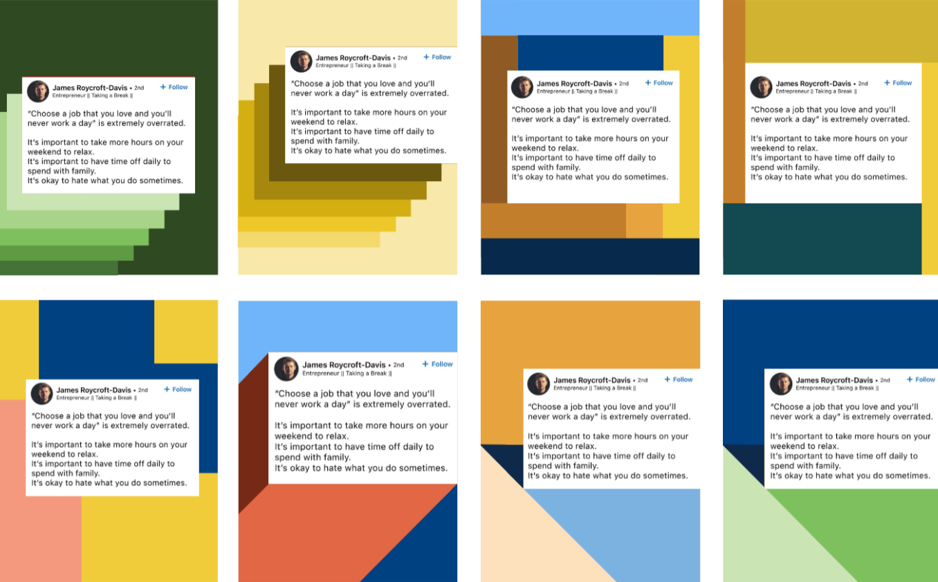
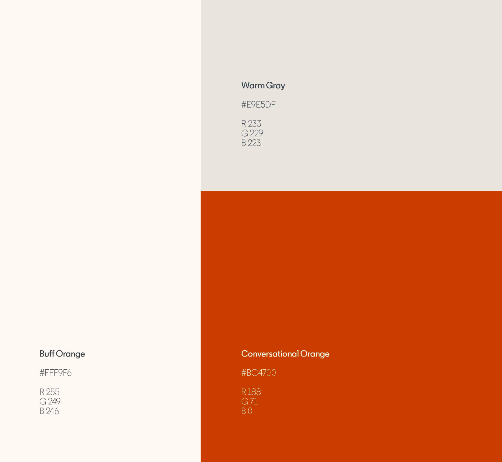
To make the expanded palette easier to use across teams, I developed Color Pathways—a system of curated color families that simplified decision-making while preserving flexibility and consistency.
Creating a More Usable Color System
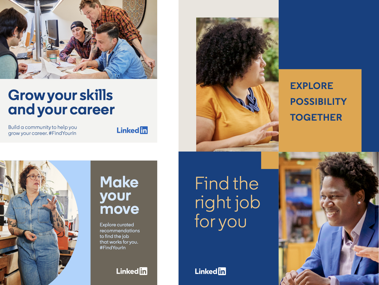
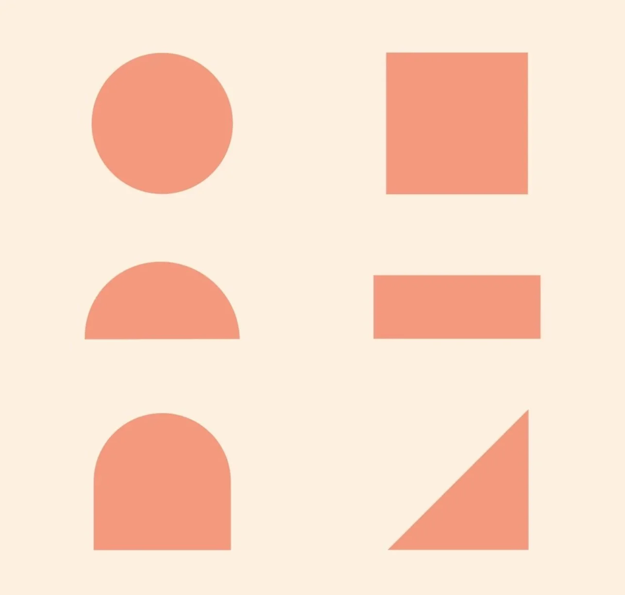
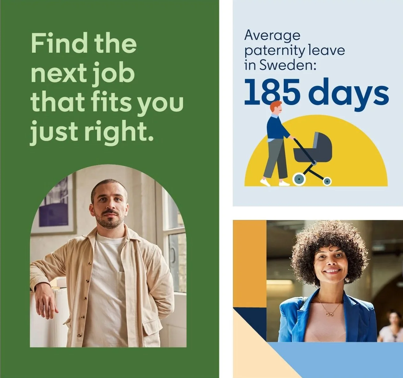
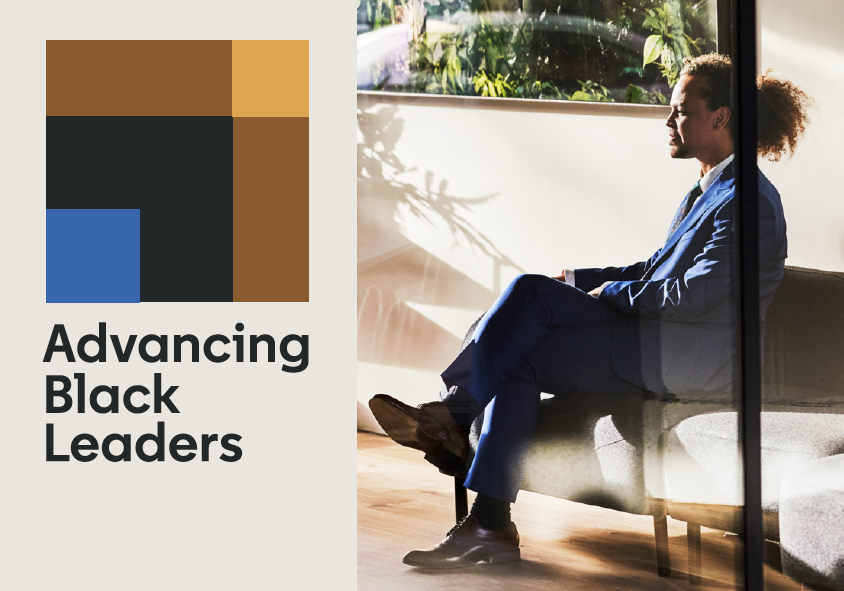
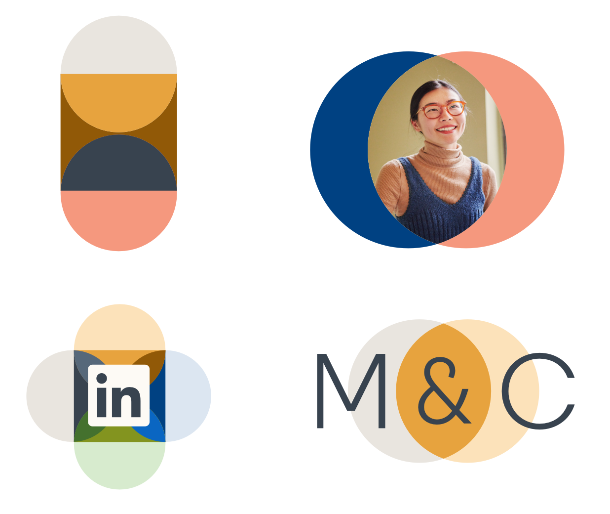
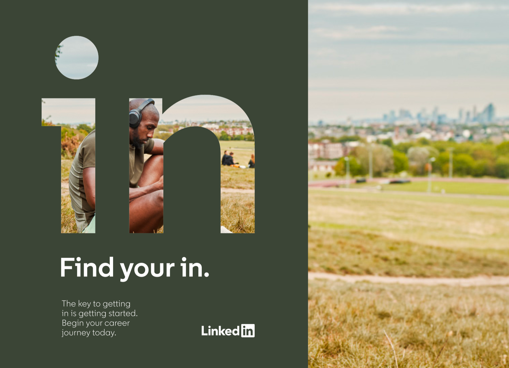
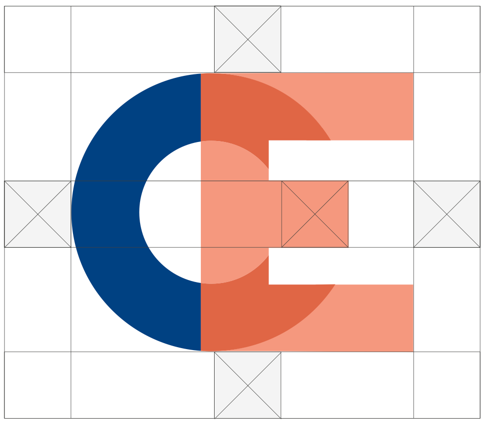
To increase the versatility of our shape system, we added new shapes and expanded guidance as well as new creative options for using them.
Shape Language
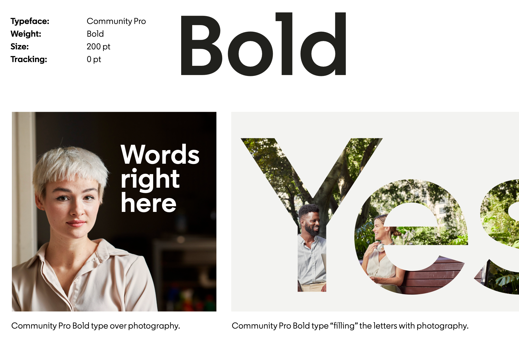
Typography System
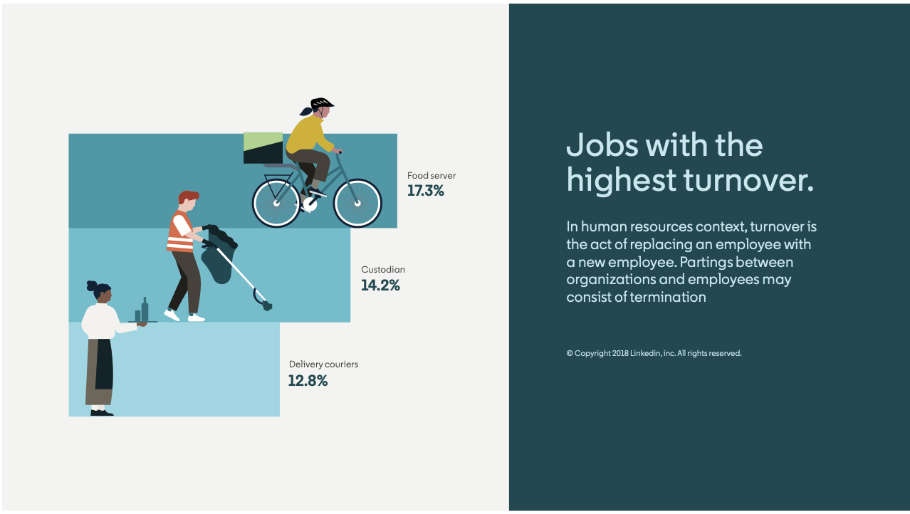
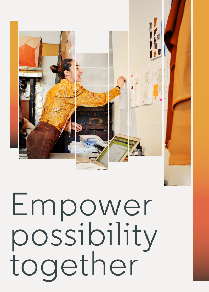
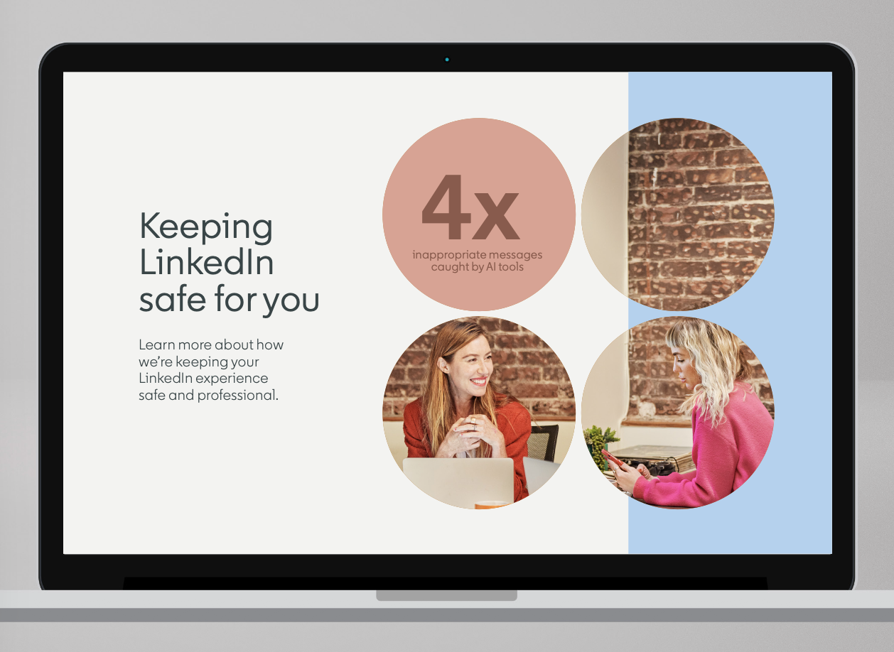
Expanded typography evolved from a strictly functional tool into a distinctive graphic element within the brand's visual expression system.
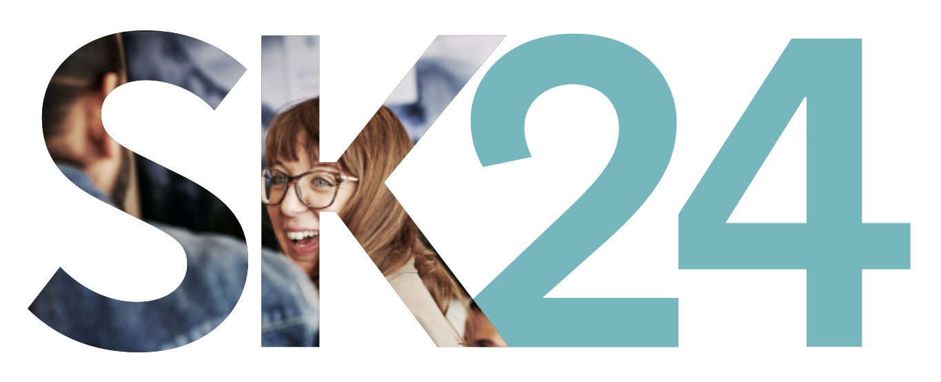
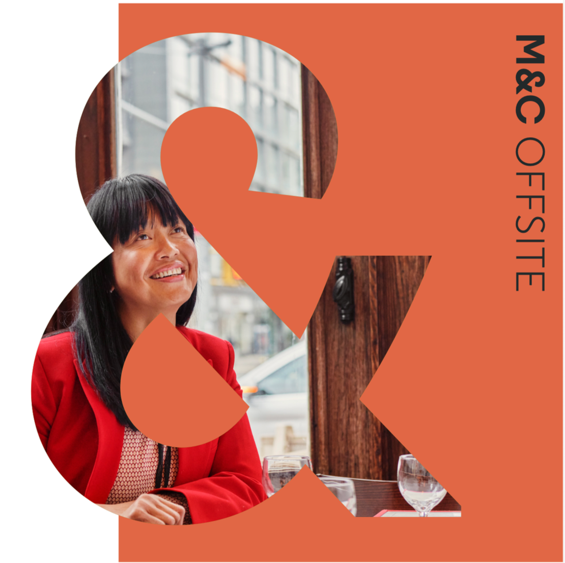

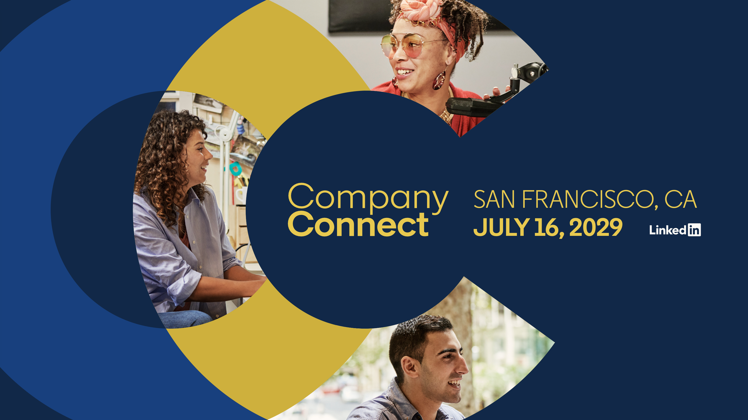
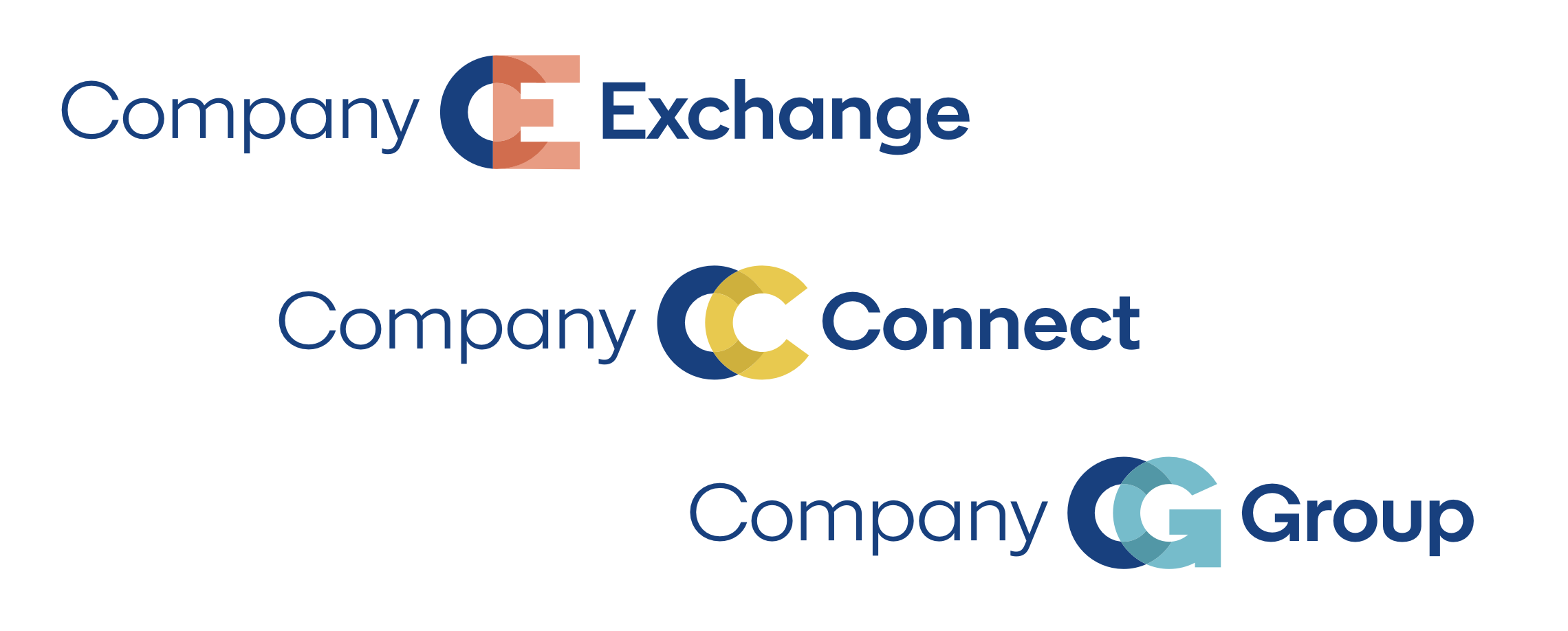
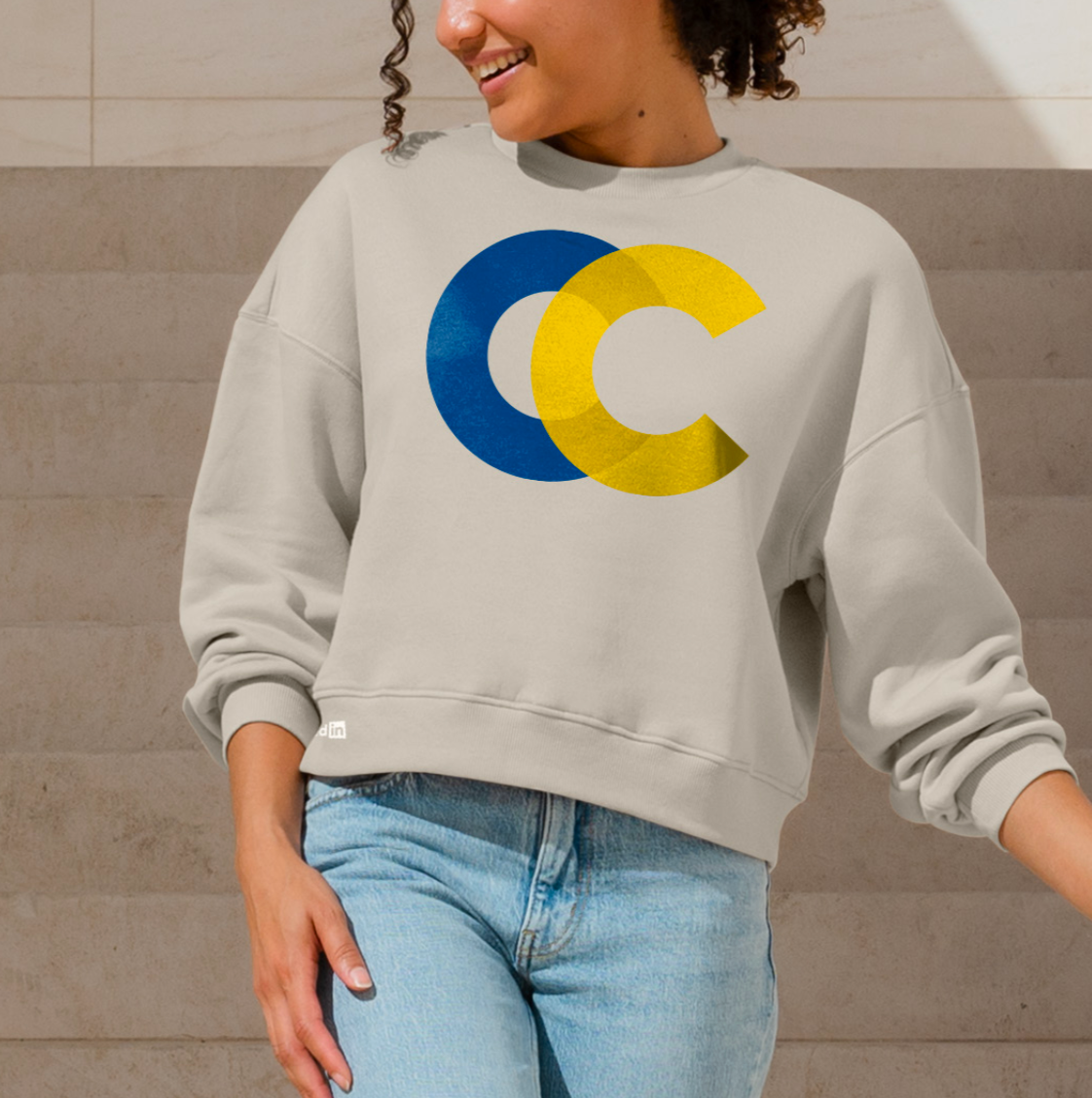
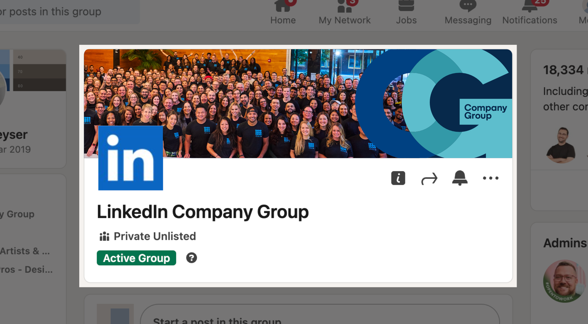
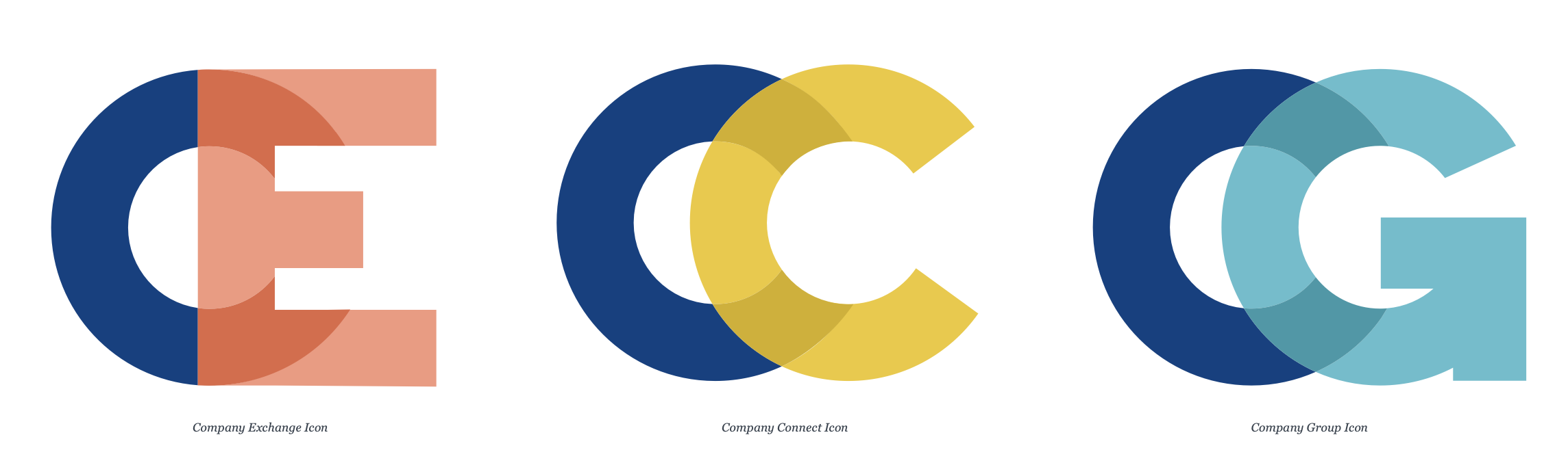
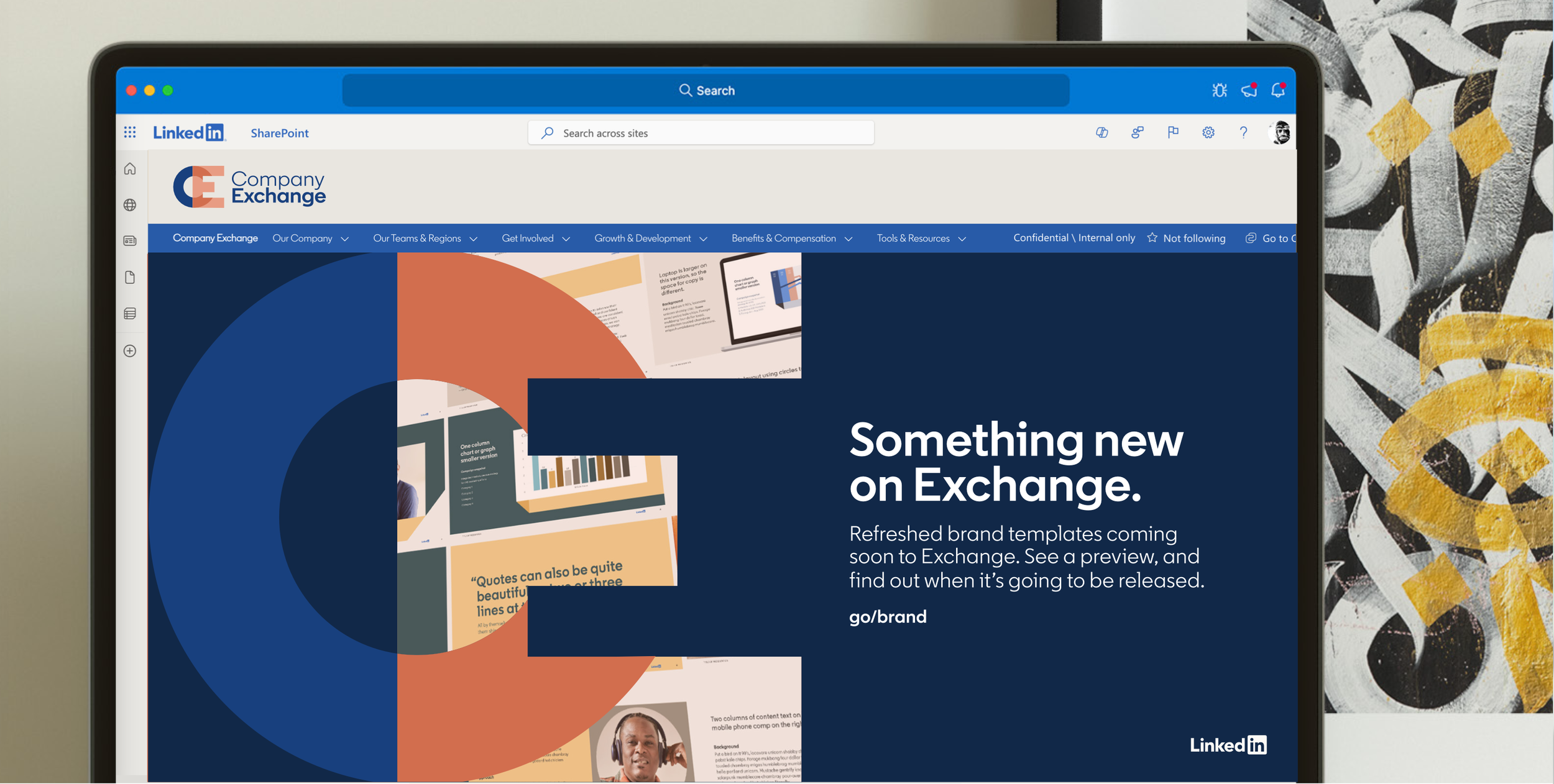
Designed a scalable visual framework for LinkedIn's internal communications programs, including Company Connect, Company Exchange, and Company Group. The system created clear distinctions between communication channels while strengthening consistency, recognition, and engagement across the employee experience.
Company Channels
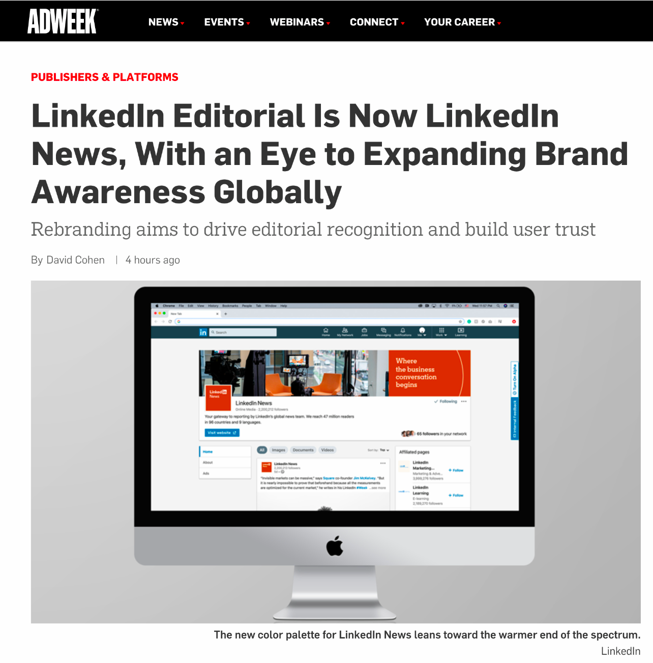
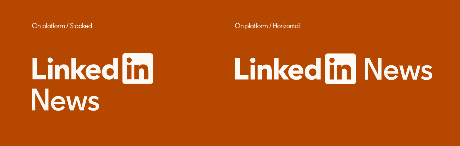
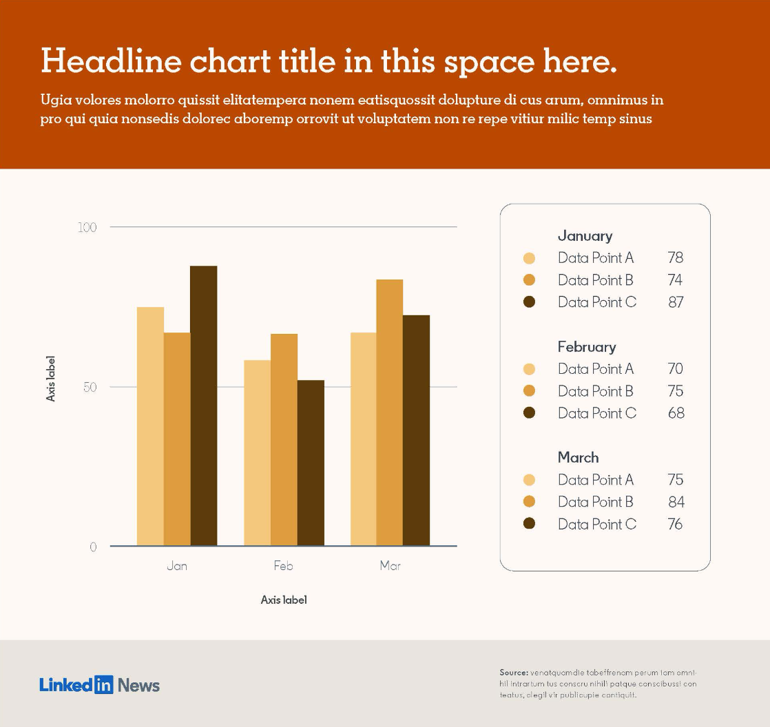
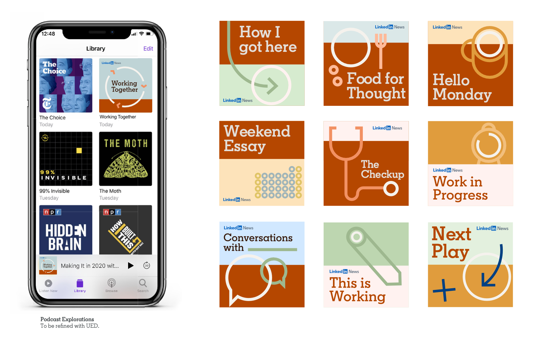
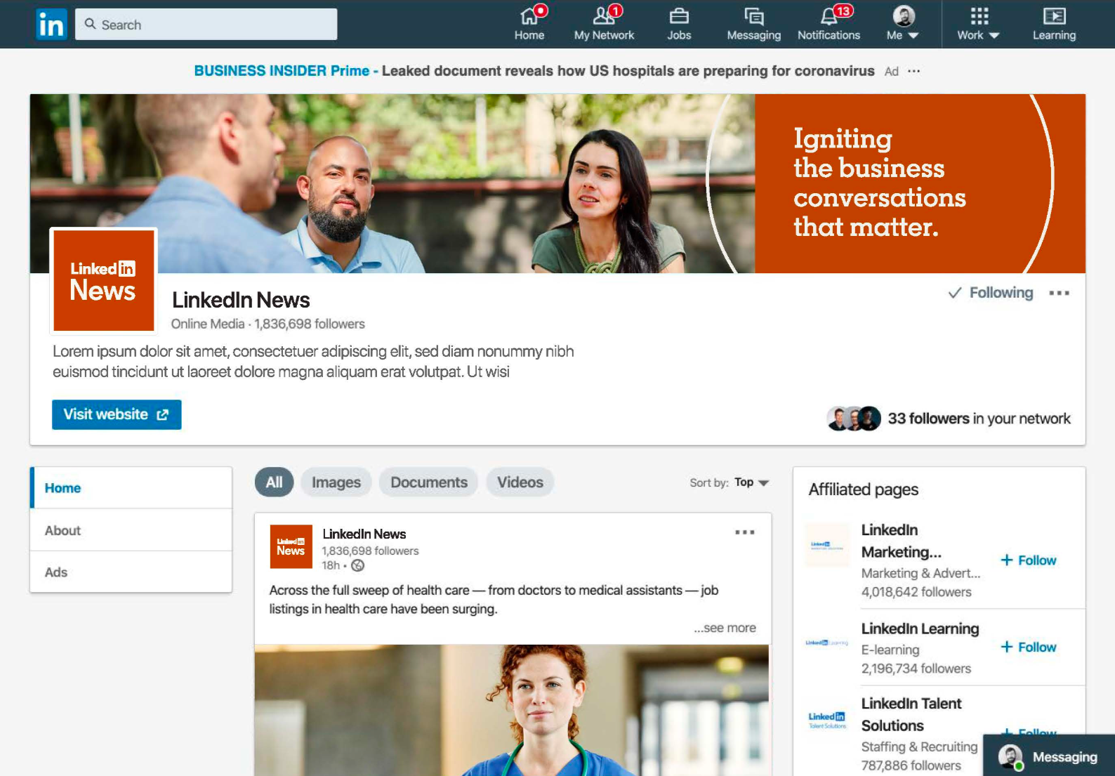
Developed a scalable editorial identity that brought greater flexibility, consistency, and visual distinction to LinkedIn News across a wide range of content formats.
LinkedIn News
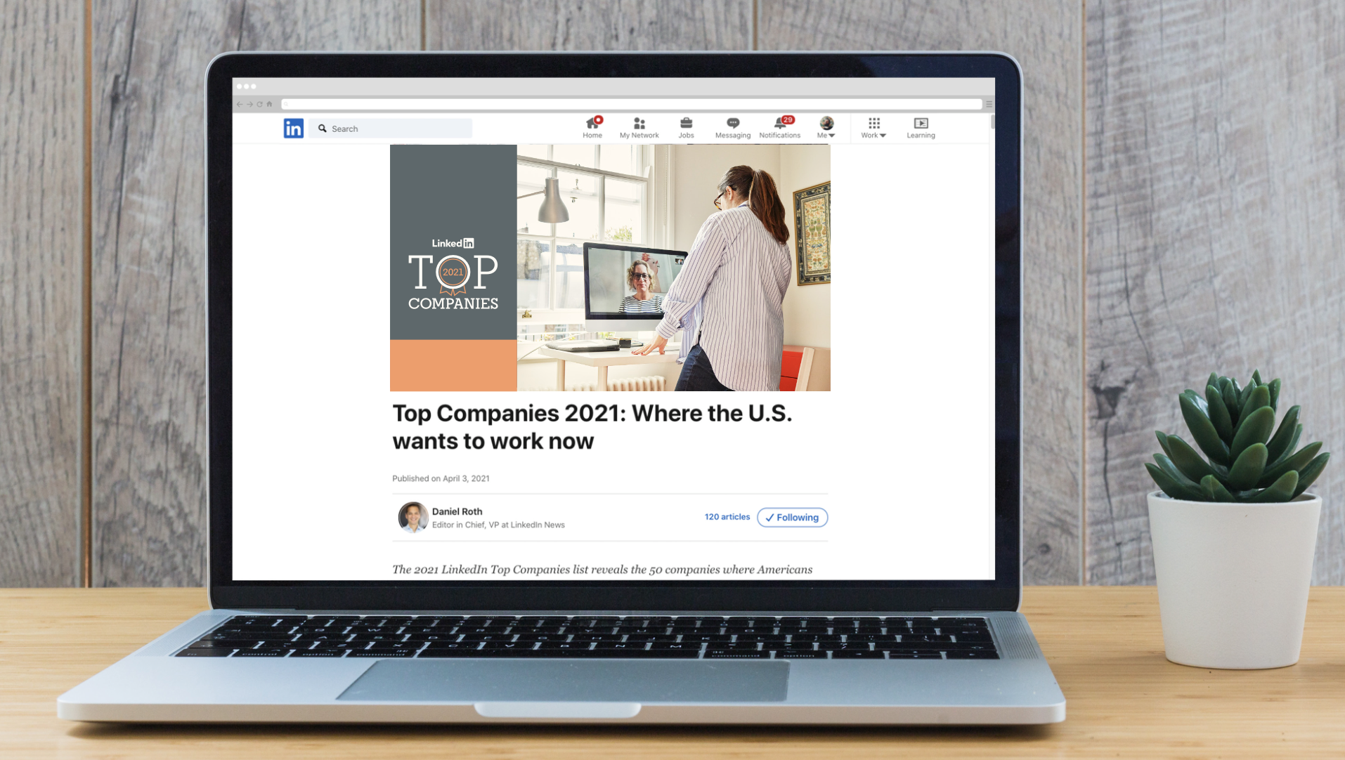
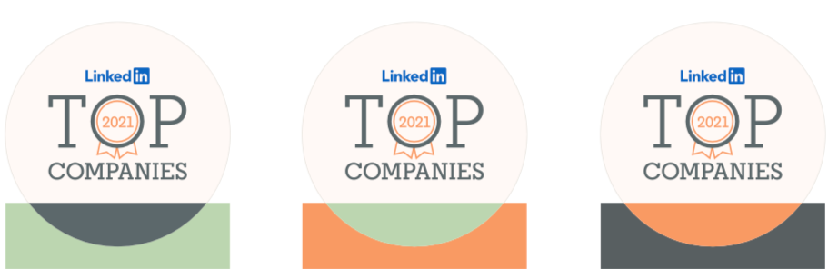
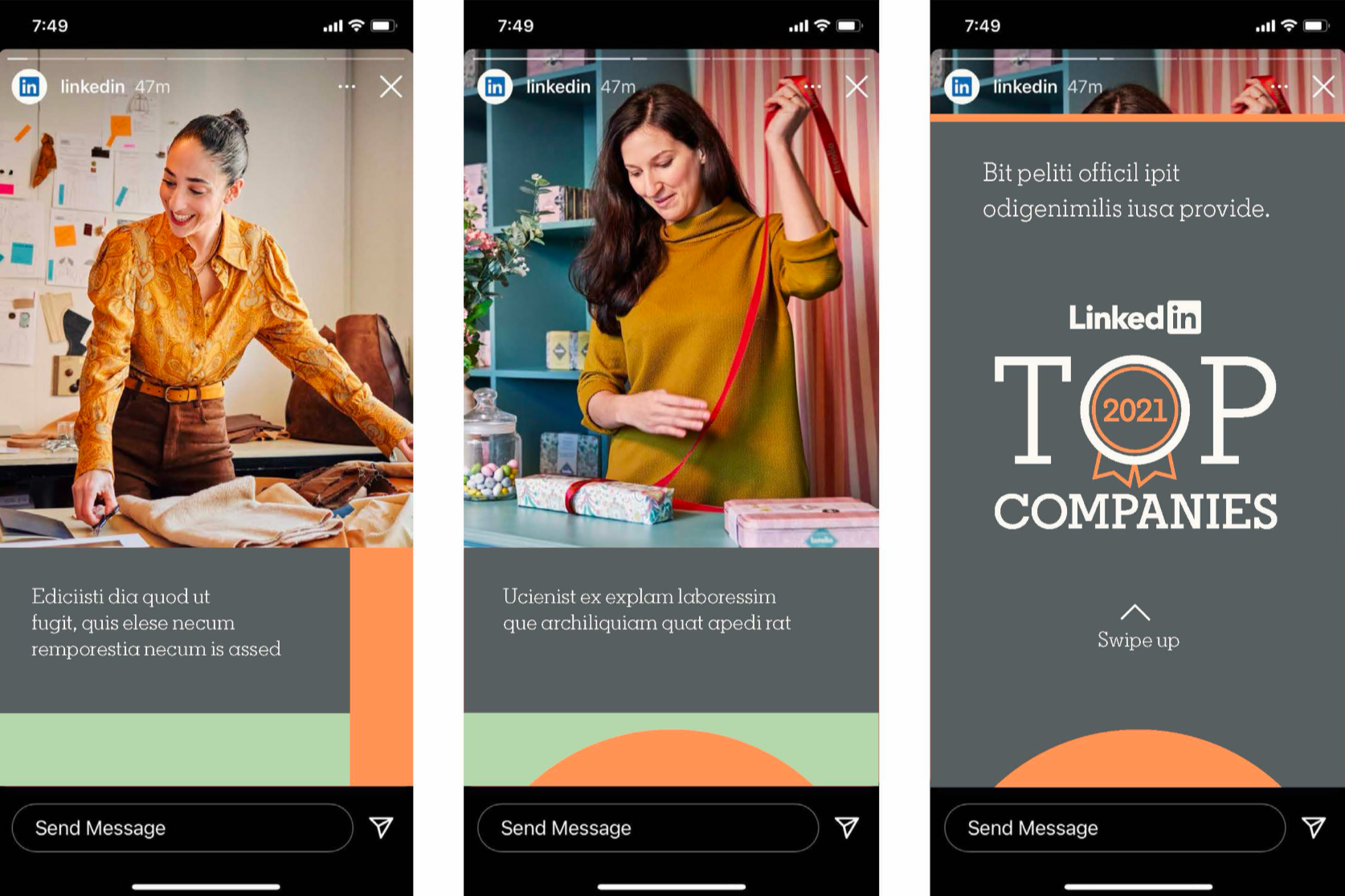
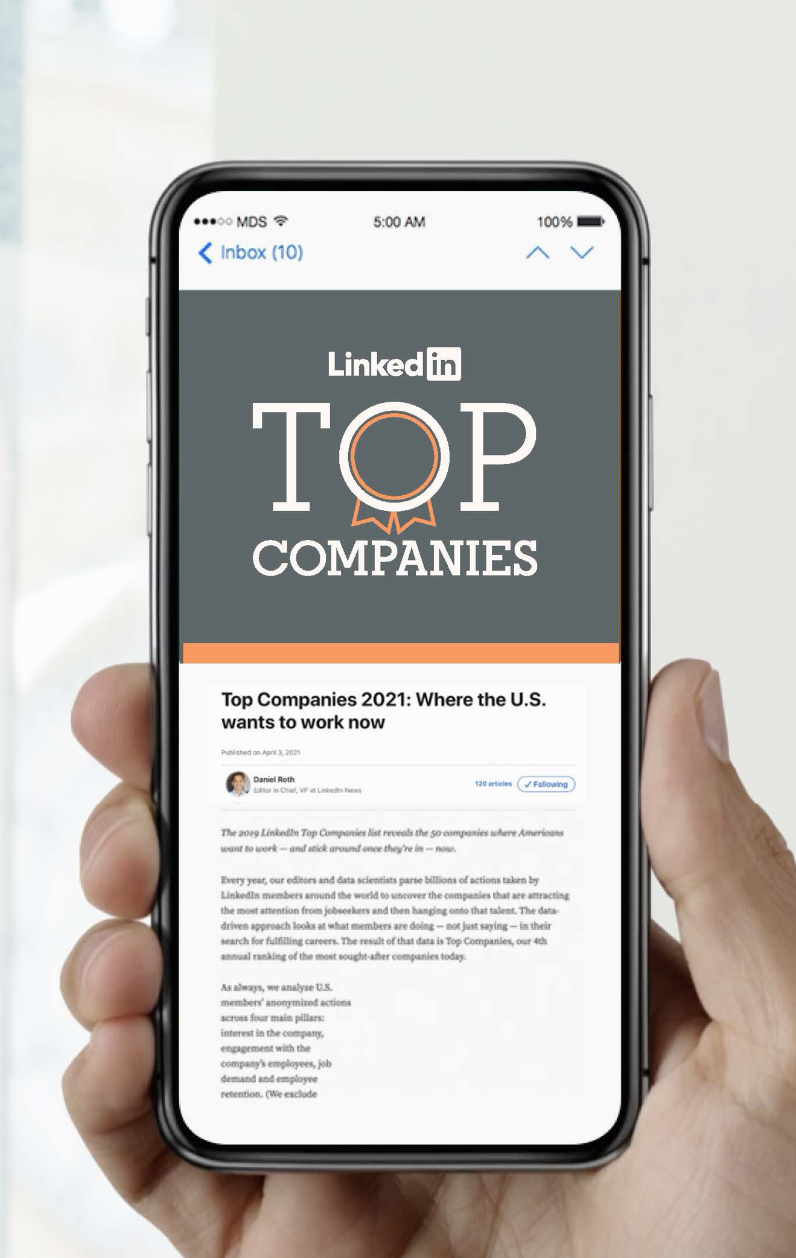
Built a flexible visual system for LinkedIn Top Companies that strengthened recognition while supporting a growing ecosystem of editorial and marketing content.
Top Companies